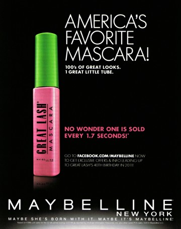
The advertisement that I chose to analyze is this one displaying a Maybelline mascara. The original image (above) came from the photographer’s portfolio website which can be found here . The advertisement using the photograph belongs to Maybelline LLC.
Contrast
This ad has some great contrast in the text that was used. The larger skinny white text at the top immediately draws the eye in and the smaller pink text is clearly separate from it. The stark difference between the bright white and hot pink on the black background is also a great use of contrast which makes the image pop and draw the reader’s eye.
Repetition
The repetition of the colors throughout the ad bring in some cohesion. There is the pink packaging on the product followed by the same pink text beside it. The fonts used in the smaller blocks of text have a very similar shape which brings unity to the piece.
Alignment

Showcasing the oversize mascara tube upright and aligning it to the text brings a focal point to the advertisement. Keeping the other text below aligned with the product creates almost a straight line down the center which makes the overall look very clean and easy to read.
Proximity

The text blocks are far enough apart to help group the information. The tagline is separate from the Facebook link which is also separate from the statistic, with the brand name all the way at the bottom. The most important claim is the first piece of information and the brand is at the bottom, boxing in the lesser important details in the middle. This ensures the reader will remember that Maybelline is the favorite mascara of America.
Color
The designer used black as the background which instantly makes it stand out and highlights the bright content on the ad. Using the lime green, hot pink and black from the product packaging in the ad design itself helps the reader to recognize the product later on. The colors are bright and bold with a lot of contrast which makes a statement.
Overall, I think this design was very effective. The look is attractive, clean and bold which I think is great for the product they are displaying. As a consumer, I think they would be able to reach their target audience/ buyer with this design.
